

A data visualisation platform for the Retail Innovation & Experience Campus in South-Holland
-
Client
The RI&EC is an organisation that works on maintaining the relevancy of the retail sector in South Holland. They do this by having students work on real-life projects in coordination with small business owners in so-called Retail Labs.
-
Target audience
- The local government (for example the centrum manager)
- Teachers from the educational instances connected to the RI&EC
- Small-business owners in the retail sector. -
Problem statement
The RI&EC needs a platform where they can access their own data, and where they can show and update information regarding the Retail Labs and well-being of shopping areas and stores.
-
My role & responsibilities
As the sole UX designer working on this project, I worked on all of the phases of the design process as detailed by the Stanford D.School Design Thinking Process.
-
Scope & constraints
The project took a total of 16 weeks from beginning to end. Covid-19 made getting in contact with the target user groups a bit more difficult in the beginning phases of the project.
-
Context
This project was done as my graduation project in coordination with the Retail Innovatie & Experience Campus (RI&EC).
Process
Research
The research goal was to gain a better understanding of the needs and wishes of the various user groups and stakeholders in relation to the future tool/platform of the RI&EC. With the help of an expert review, I analysed how different programs/websites approach solving the same problem. Tableau, for example, takes a very technical approach, while Score takes a more business/management perspective. For the expert review itself, I rated each platform on ten different UX related statements and found where they excelled or where they failed.
I also interviewed potential users and stakeholders to better understand their view of the platform and what their needs and wishes were in relation to the RI&EC and the new platform. Based on these interviews I created three personas.
All of the information from both desk research and interviews was collected and put as sticky notes on a Miro board which gave me a comprehensive overview of the information and their sources.


Defining the research
To be able to use the research for my ideation process, I created a list of research insights. I did this by collecting the sticky notes that had similar information and giving them titles. I then split the list of insights into two different lists. One pertaining to the needs and wishes of the users, and one about design principles of data visualisation.
I used the insights in the first list to guide my ideation process regarding what content to show and what features to add to the platform. The second list was used as a quick list of reference about things to keep in mind regarding the design of the platform.


Ideation
For the ideation and prototyping & testing parts of the project, I worked in several week sprints, similar to a Scrum sprint. The reason for this was to make sure I would be able to have regular testing intervals and checking moments with the client.
The first "sprint" was mostly about ideation. I started with coming up with several How Might We questions (HMW's). I then came up with solutions to these questions. I also had a small document with random ideas that I had gotten while doing research. These were not really ordered by anything and mostly just random thoughts.
I then wanted to start designing, and decided to begin with creating mood boards and digital sketches to accompany each. I created two different mood boards that could be used to set the vibe of the platform. One was more playful and free-flowing, while the other was more rigid and had a more professional look and feeling. From this, the client and users all agreed that the more professional and rigid approach was more in line with what they wanted.
-

Early ideation
This image shows some of my early ideation and the “How Might We…?” (HMW) questions that I used.
-

First concepts
After coming up with some HMW questions and ideating on them, I decided to create two moodboards with a concept each. I did not put a lot of thought in the specific design of each concept yet though. The goal was to get an idea of what kind of feeling the client wanted to give off with the platform. Both the client and all of the stakeholders that I spoke with preferred the more professional/business-like concept.
-

Mobile design evolution
After having created my first concepts, the client and I both came to the conclusion that it would be better for me to continue working on a mobile version of the platform in stead of a PC version. Thus I went back to drawing, while still trying to keep as much from the previous concepts/ideation as possible.
Here the evolution of the mobile design from sketch to final prototype can be seen.
Prototyping & testing
In the second part of the first "sprint" I started creating a low fidelity prototype in Figma. I made several versions, trying out different lay-outs and different ideas. I mostly divided the screen into three different parts, the menu on the left, an overview part in the middle, and more in-depth information on the right side.
After this had been shown to the client, they selected the version with a collapsed menu, to be the most promising as it allowed the users to also adapt the platform to their individual needs. However, I brought up the topic of mobile design, and together we decided that it would be best to continue with designing for mobile devices first, because that would allow for an easier transition to pc devices later on as opposed to working from pc to mobile devices. I would however try to keep as many of the core concepts and ideas from previous ideation and prototyping as I could.
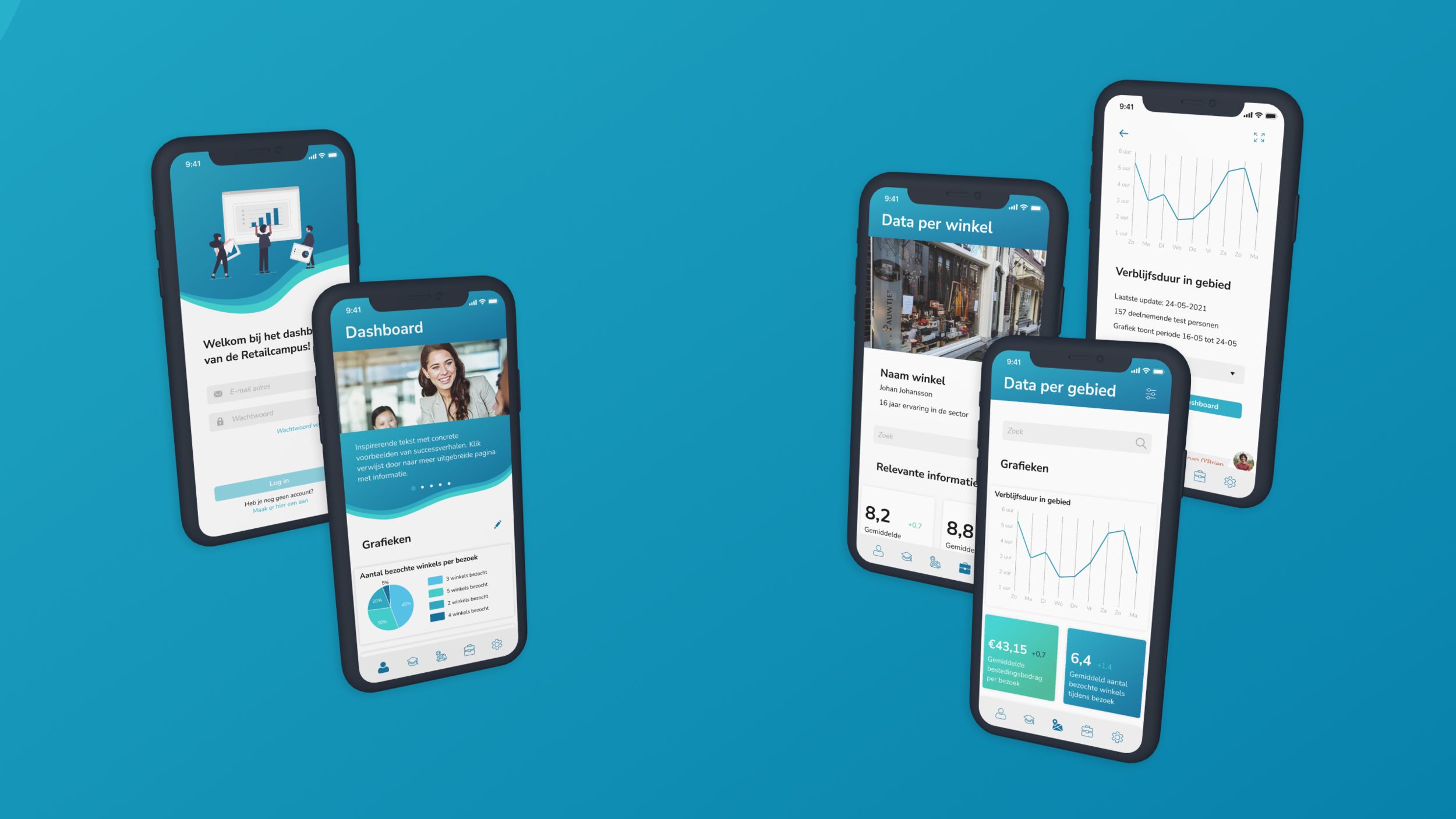
In the end, I came up with a mobile dashboard where the user can not only view all the graphs and information they need, but where they can also add whichever data they want to their own personal dashboard. That way, they can put various graphs next to each other and easily compare them to draw valuable insights from these comparisons. On top of that, I also added some features that should make it easier for the educational instances connected to the RI&EC to monitor the value of the Retail Labs. Watch the video below for more information on the app and its features!

Outcomes and lessons
The client's response to my process and the final design was incredibly positive. Both he and various stakeholders mentioned that they were enthusiastic to begin developing the design into a working platform and start rolling it out to the target audiences. My mentor and assessor were also happy with my process and the result. During the final assessment, they specifically mentioned my great skill in communication as an important and good skill to have.
As I completed this project by myself, I really learned how important it is to create a solid plan and schedule and to mostly stick to it. Towards the end of the project, I became increasingly happy with the fact that I had planned everything to be done several weeks before the deadline so that I had extra time to spend on polishing the project. By doing this, I also left myself some room in case other parts of my planning were to take longer than expected. This made sure I was able to keep a good overview of what needed to be done at which time and how to do it.
It also taught me about the difficulty of having to balance the need for a creative, out of the box idea, with the needs and wishes of the client. Because, from my mentor's point of view, I could have taken a more out of the box approach and maybe found a more playful way of solving the problem. But the client and stakeholders/target groups were extremely happy with the designs I was showing them.