
Taskforce: UXD
Data visualisation project for the intelligence department of the police force in The Hague
-
Client
The client of this project was the intelligence department of the The Hague police department. They are mainly responsible for collecting and analysing information in order to be able to solve crimes.
-
Target audience
The target audience was the people working for the intelligence department. Specifically, detectives who were trying to solve criminal cases.
On top of that, we were asked to keep in mind that most of the detectives within our target group would not be able to use complicated software, so we should make it user-friendly for people with little digital skills.
-
Problem statement
Currently one employee of the Intelligence Department is responsible for putting together information and visualising it on a map for a better overview. This workflow is not very efficient and requires constant requests for specific data/situations on the part of other employees.
Furthermore, the department has no adequate system for said data visualisation. The responsible employee creates the maps himself by placing emoticons symbolising specific occurrences on the relevant areas. -
My role & responsibilities
Though the complete group consisted of 5 people, we decided to split up in 2 teams for the majority of the project. Thus I worked along with one other student on the project. In this, our roles were the same, so we worked equal parts on the research, as well as the ideation, designing and prototyping.
-
Scope & constraints
The project took up around 8 hours per week for both me and my fellow student, and took a total of 16 weeks to complete. After these 16 weeks however, we decided along with the other group of students working on this project to get together and combine the best aspects of both of our concepts into one final design. This took another week or so to complete, and was done outside of the need of our school project, but we were all happy to be able to offer the client something even better.
Another important factor in this project was the COVID-19 pandemic. Because of the pandemic we were not able to get in contact with someone working at the intelligence department to do user testing, and had to rely on the feedback we got from our client. -
Context
During the project we worked for two people who work at the intelligence department, and one person who acted as our direct contact point.
I was asked to participate in this project, along with 4 other students.
Process
Research
As user research was not an option during the pandemic we focussed our time on researching types of data visualisation, as well as different types of maps and how to show data on a map
For map types we found 6 possible options: point maps, line maps, regional maps, flow maps, heat maps and heat-point maps. We decided that for the police, heat-point maps would be the most useful, as they can be used for a multitude of relevant use-cases.
With regards to the different types of data visualisation, we came to the conclusion that a timeline would be the most useful for our client, as it shows how the data developed over the course of time.
Ideation
After doing the research, we came up with several “How might we…?” questions (HMW’s). For each HMW we did a rapid ideation brainstorm to come up with several different solutions and ideas. The HMW’s were:
HMW visually differentiate different categories of data on a map?
HMW show a change in data over time?
HMW allow toggling between different layers?
HMW instantly show the most important information at a glance?
HMW allow officers to customise the interface to suit their needs?
HMW enable officers to add data in an intuitive way themselves?
HMW make sure that officers with different technical skills are able to use the system?
Based on this ideation, we started with creating hand drawn sketches. These were mostly used to get some ideas on paper, as well as to see how specific ideas could work out.
I created sketches showing various levels of detail, and how I thought different types of maps could be useful for the police.
Prototyping & testing
My partner and I first created low-fidelity (lo-fi) prototypes separate from one another. We did this to give more time for our individual ideas to develop themselves. After that we got together to take the best parts of both designs and combine them into one cohesive high-fidelity (hi-fi) prototype.
Low fidelity prototype
After deciding which ideas from ideation and early concept sketching to continue with, I created several low-fidelity wireframes/mockups. In this lo-fi prototype I wanted to explore different types of maps and functionality. I added a timeline function where relevancy of data is shown by the transparency of the icon. The older a piece of data was, the more faded out it would be. That way an officer can instantly see what information is the most recent while still having an overview of all of the applicable information.
I also designed a means of adding data points for the people working at the intelligence department. They could do that either manually, or by importing data sets using JSON or CSV files.

-
![]()
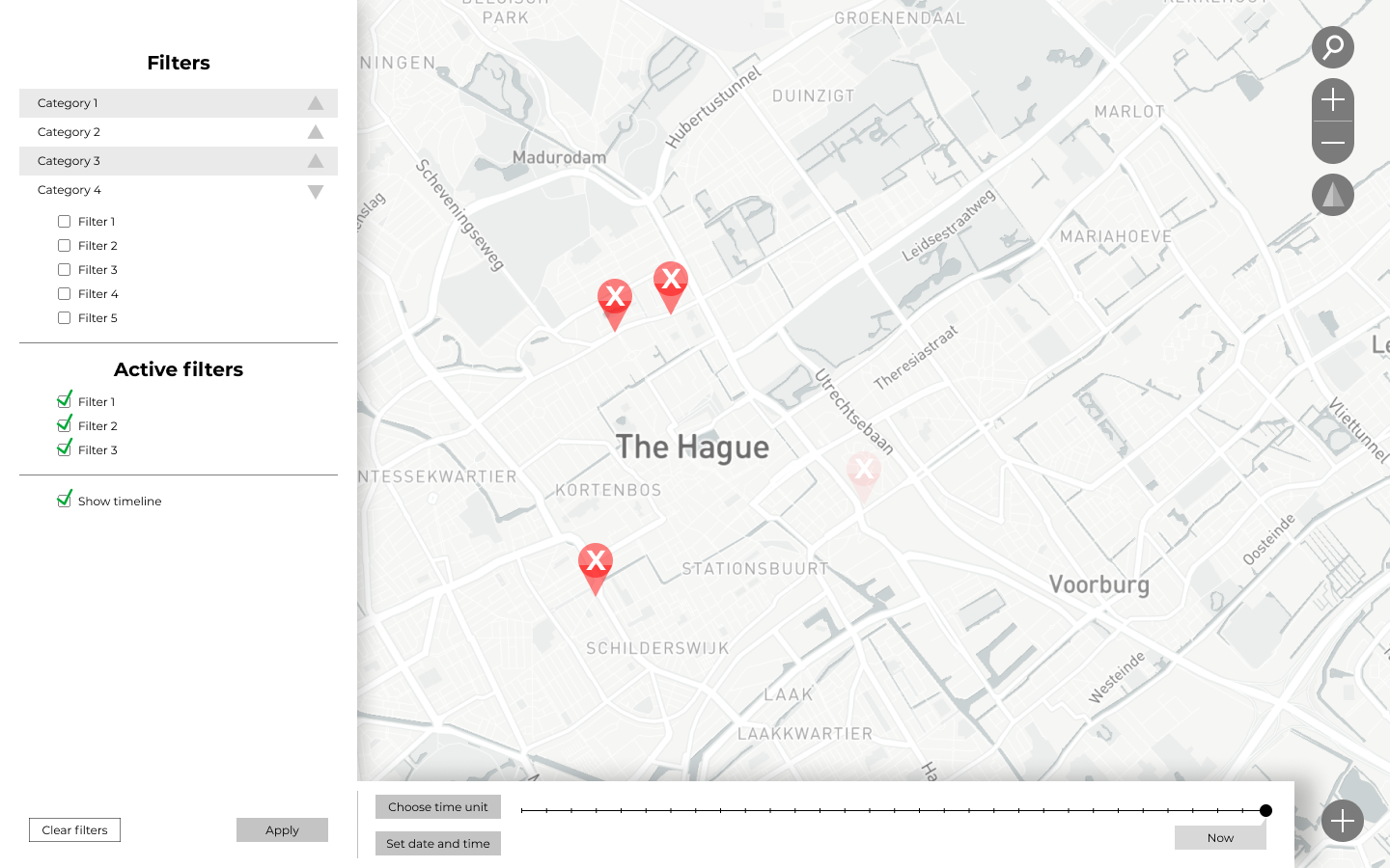
General map
This is the general lay-out of the map, with on the left hand side controls for what filters/layers to view and on the right hand side controls to use the map itself.
-
![]()
Map with timeline
To show how the data changes over time, I added a timeline. The officers can then add the information to the dashboard and set it on a specific date. The map then shows the information and the older it is, the more it is faded out. That way, an officer can easily distinguish between older and newer snippets of data.
-
![]()
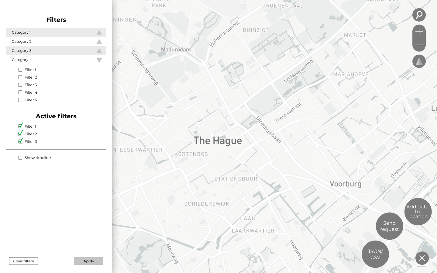
How to add more data?
I wanted to make it easy for officers to add data themselves. I chose to give them three options: Use a JSON or CSV file to upload the data, send a request to the data team or add information to a specific point of interest.
-
![]()
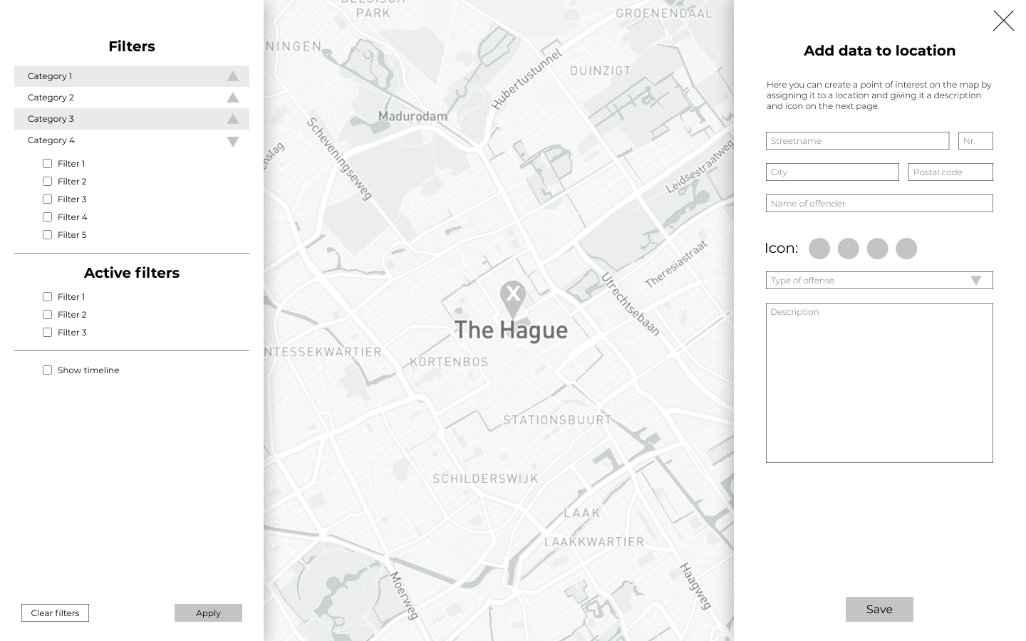
Add data overlay
This is an overlay that opens when an officer wants to add his own information to a point of interest. It asks for some basic information, as well as more specific to the type of data that is being added.
-
![]()
Overview of the region
Here the officers could get an overview of the entire region or sub-regions in The Hague with some information.


High fidelity prototype
For the final design, we cleaned up and expanded the log-in process, and allowed the user to choose from ongoing cold-cases so that information can be pre-loaded. For the design, we chose to keep to the style of the Dutch police force.
For the lay-out of the map we decided to stick as much as possible to lay-outs of commonly used map software such as Google maps, or Maps by Apple. We added a timeline that shows the development of data over the course of time. It can show various scales of data such as minutes, hours, days, months and years. The blue dot on the timeline can be slid to highlight a different time, or another point on the timeline can be clicked. The markers on the map fade out over time, to show which ones are more recently added.
Each marker can be clicked to show more in-depth information regarding that point of interest.
We realised that different zoom levels on the map call for different levels of detail. Thus, we used a heat-point map system, where a higher density of points of interest are displayed using a bigger point with a number signifying the number of points of interest. The colour of the dots are determined by the dominant type of information.


Outcomes and lessons
This project was nice for me, because it was the first project where the teachers did not really interfere with the project at all. That meant that we had to do everything ourselves and figure things out without much or any of their help. At the beginning of the project I said I wanted to learn more about how to maybe use map software like Mapbox, however I only looked into the software a bit. During the project I found out that learning how to use the software specifically for this project would not be worth the time/effort because it is quite a complicated program. Therefore I did not delve very deep into that particular software.
Another goal of mine was to get more experience in conforming to what a client wants. In the beginning this was a very difficult thing because there was no teacher to fall back on, however eventually Sarah and I managed to get a good grip of what the client wanted and this really did feel as sort of an accomplishment to the both of us. Because we had meetings with the client every couple weeks I really had the chance to constantly adapt my designs and concepts to the feedback they gave me and the others. This was quite a comfortable thing.