
D.S.B.V. Shot
A redesign for the website of my beach volleyball association
-
Client
D.S.B.V. Shot is a beach volleyball association for students in Delft.
-
Target audience
The target audience mainly consists of the association’s members, as well as people who are potentially interested in joining the club.
-
Problem statement
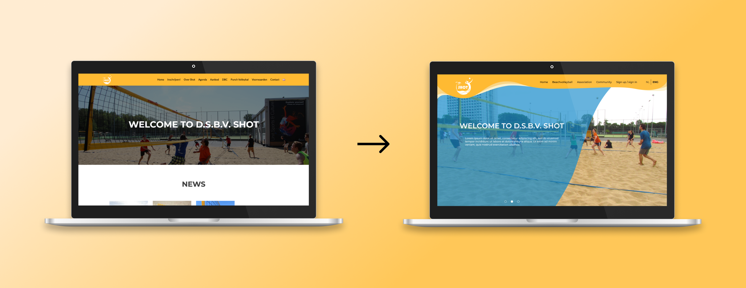
Their old website was outdated and put together very quickly. They needed a website that would last them for years to come both visually as well as in the way it was coded.
-
My role & responsibilities
For this project I was contacted by the board of the association and asked if I wanted to create a redesign for their website. As such, my main responsibilities were visual and graphic design.
-
Scope & constraints
This was a project I did in my free time as a volunteer. Thus, the time I was able to spend on it varied from week to week.
-
Context
I worked on this project alone, though I was able to discuss my ideas with both the board as well as the people who were going to build the website.
Process
Design system
I started with creating a style guide for the new website. I based this on a discussion I had with one of the association's board members where we discussed what kind of website they wanted. They stated that they wanted the website to match more with the type of association they were, and to give it a bit more personality. I chose to stick with the colours of the logo for a big part of the website and added some sandy colours for the menu bar and blue secondary colours to accentuate or highlight items on the site.
I decided to stick to a clean and modern font and went with Montserrat.

Early sketches
Because I thought the menu bar on the old website looked too boring and bland I decided to change that up first. Since Shot is a beach volleyball association, I thought it would be nice to add some inspiration from a beach or sand. I gave the menu bar a more wavy shape and added some secondary colours to increase the feeling of a beach. This way, it would also work better with the round logo. This also gave the whole website a more dynamic and playful feeling, which was something the board really liked.
I then designed several approaches to the home page so that I could show them to the board and discuss with them which one they found the most promising.
-

Variation 1
-

Variation 2
-

Preferred design
Final design
I started with creating a style guide for the new website. I based this on a discussion I had with one of the association's board members where we discussed what kind of website they wanted. They stated that they wanted the website to match more with the type of association they were, and to give it a bit more personality. I chose to stick with the colours of the logo for a big part of the website and added some sandy colours for the menu bar and blue secondary colours to accentuate or highlight items on the site.
I decided to stick to a clean and modern font and went with Montserrat.